MiQ: Data visualisation brand guidelines
Data is at the core of everything we do at MiQ.
Initially hired as a Data Visualisation Designer to design Tableau dashboards for communicating media performance insights, I soon identified a broader challenge - dashboards and reports lacked consistency across global teams. With no universal guidelines, those discrepancies made it harder for customers to quickly grasp and act on insights, having a negative impact on revenue targets. To address this, we needed a standardised set of principles and visual assets to ensure a cohesive and consistent approach to data visualisation in client reports.
After successfully pitching the project to the board of directors, I collaborated closely with data science, analytics, product, and client services teams to:
01.
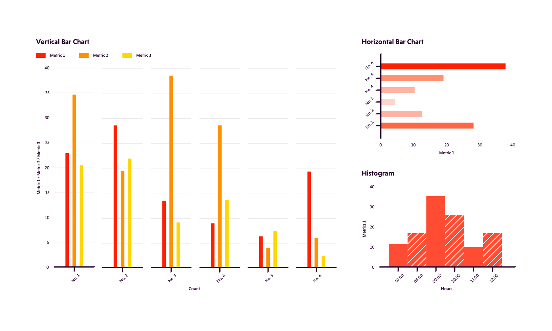
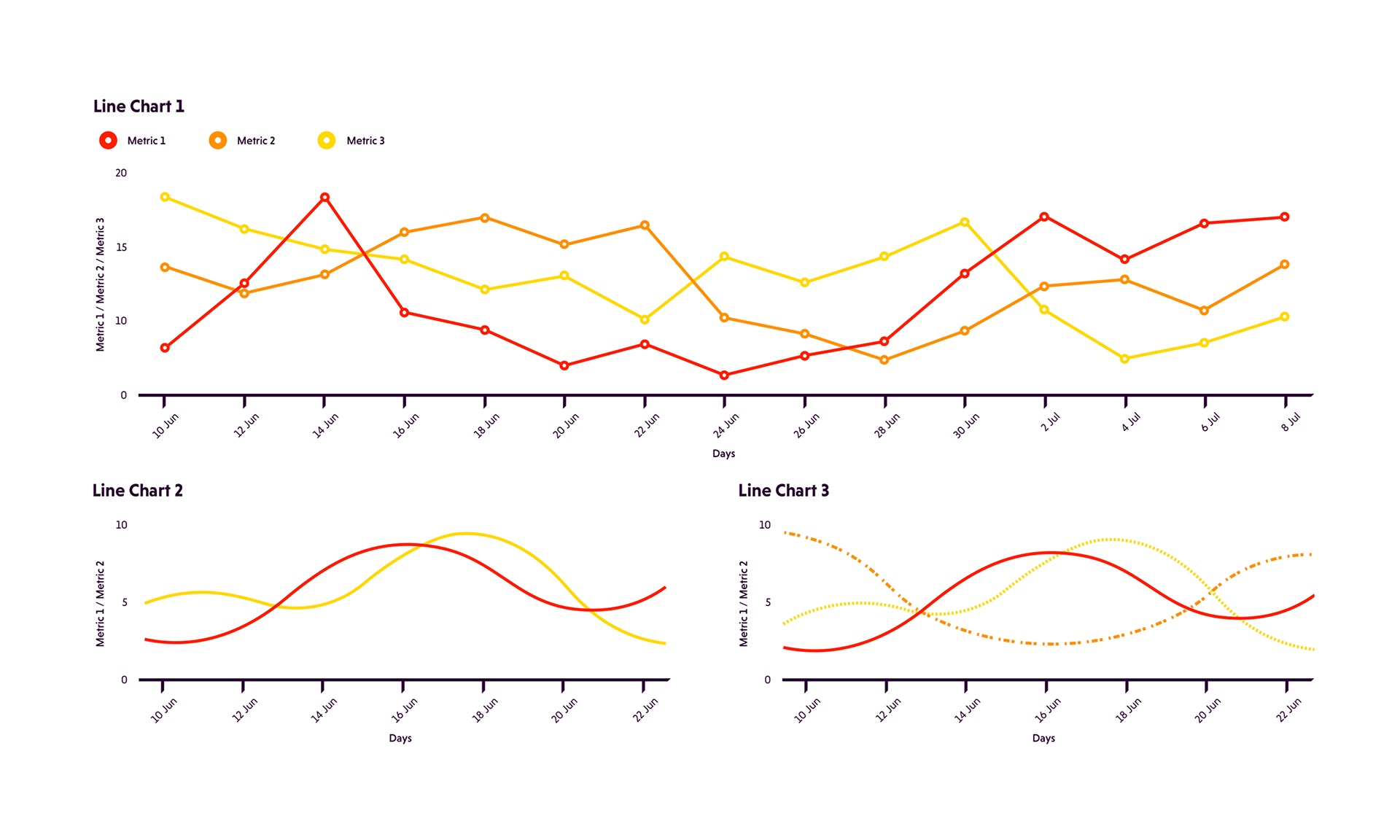
Design a data visualisation style
Design a data visualisation style
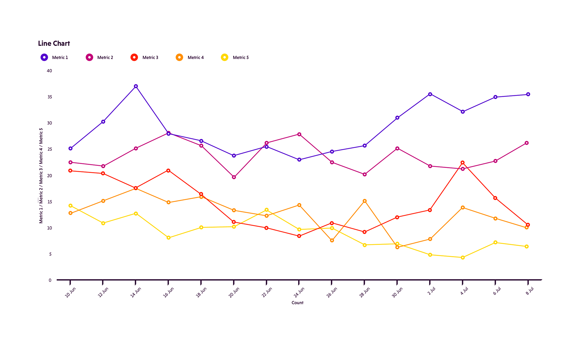
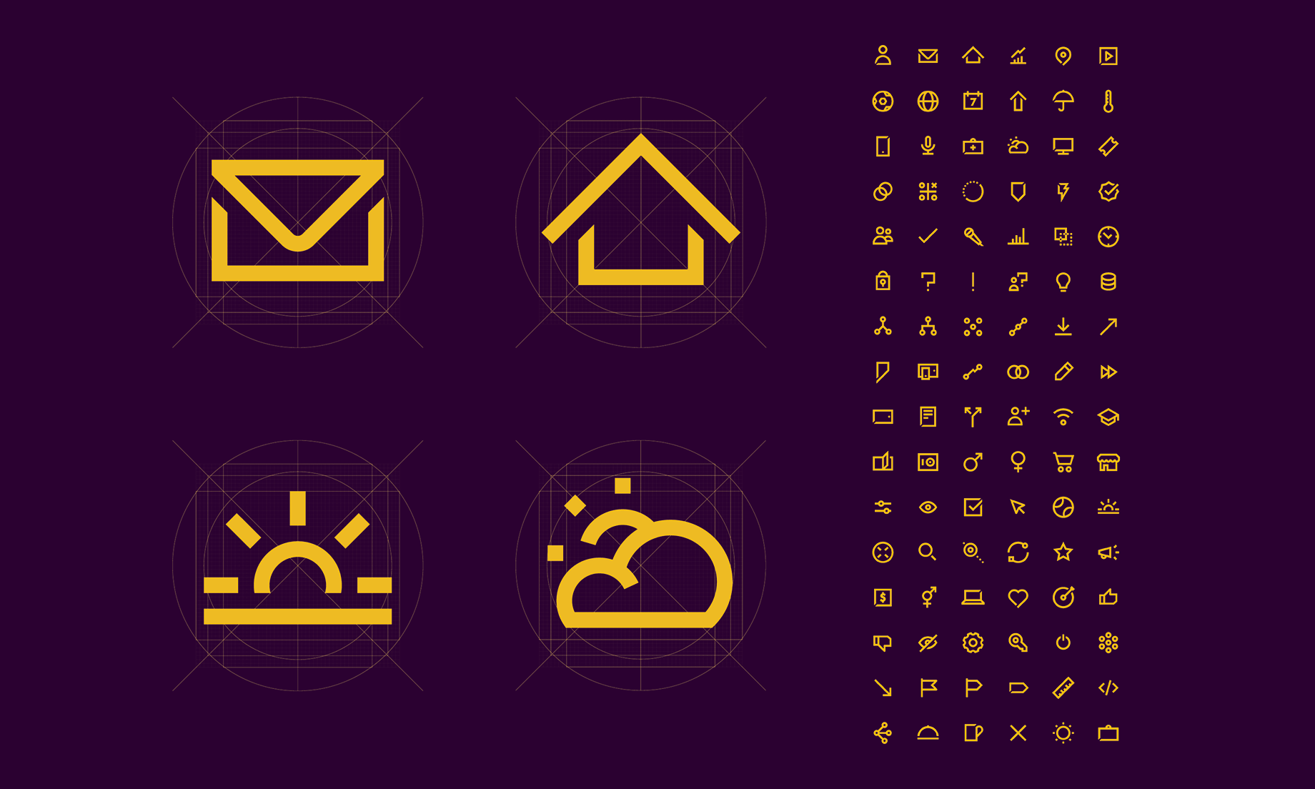
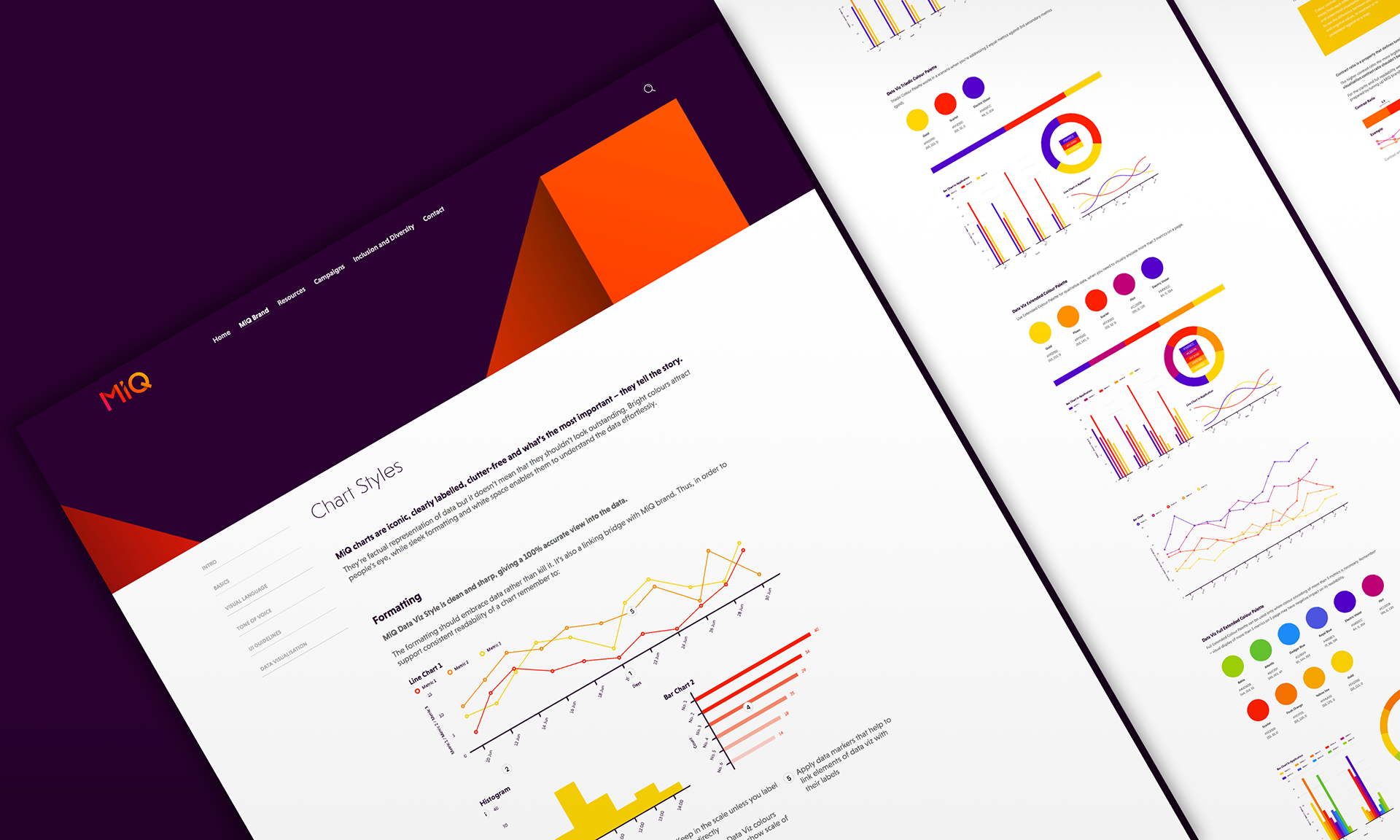
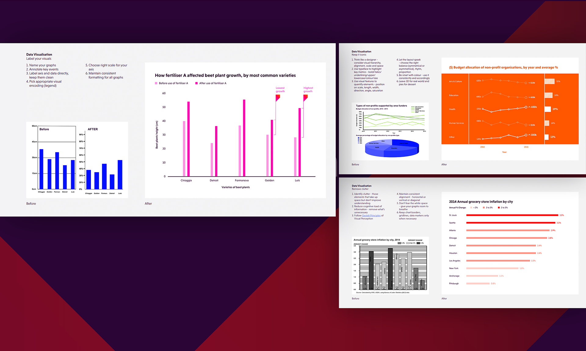
Including data vis colour palette, charts formatting, iconography, and examples of application, that is consistent, universal, accessible, and aligned with MiQ's brand:
02.
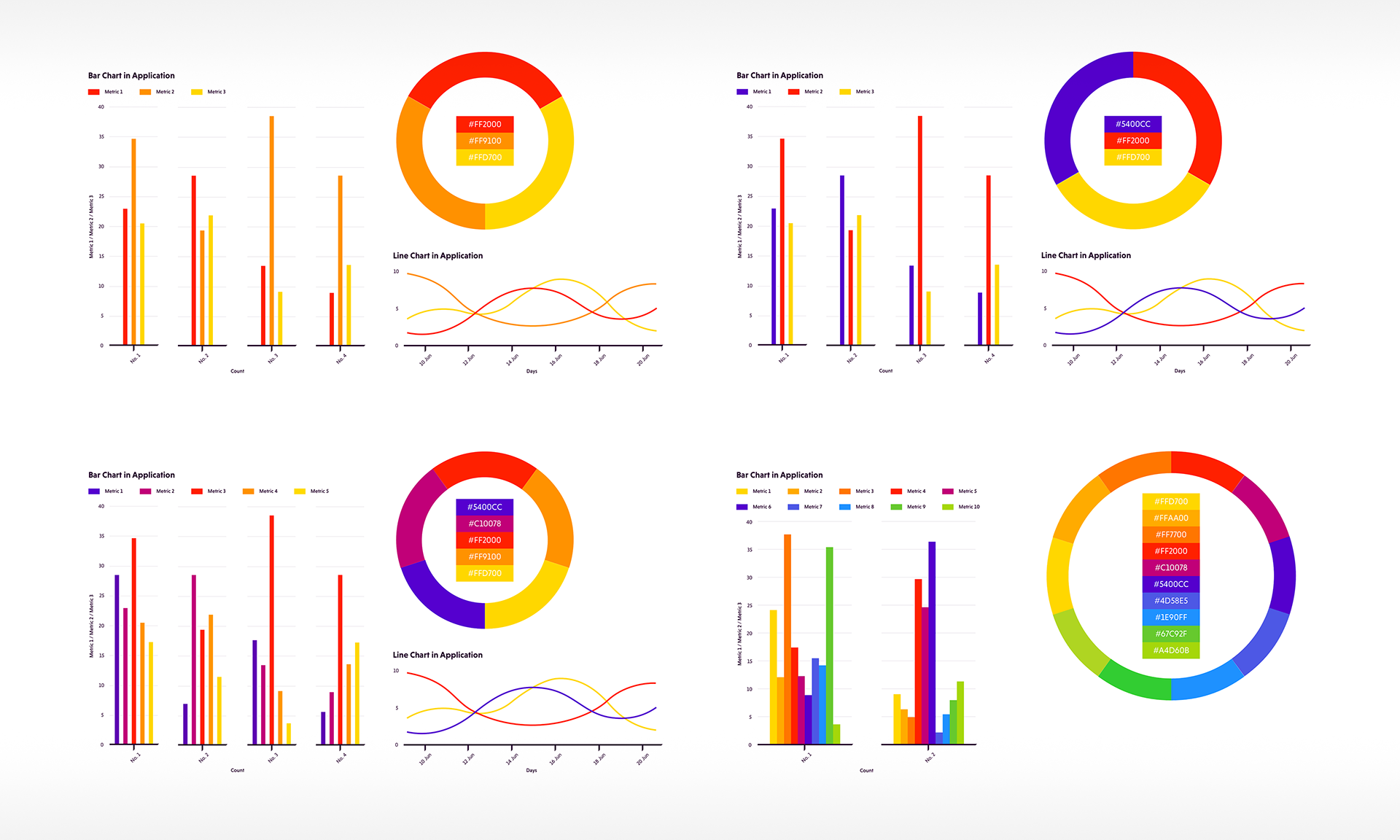
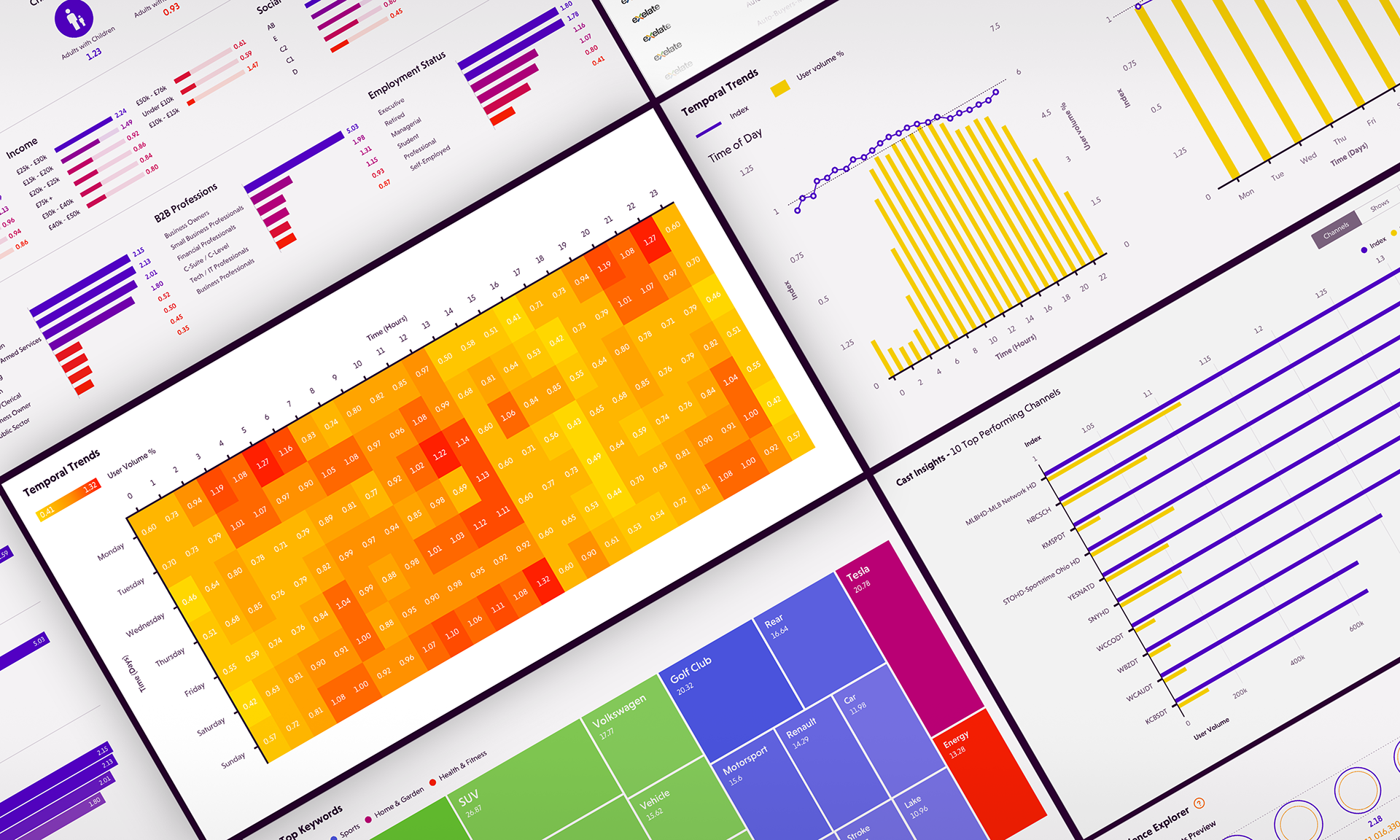
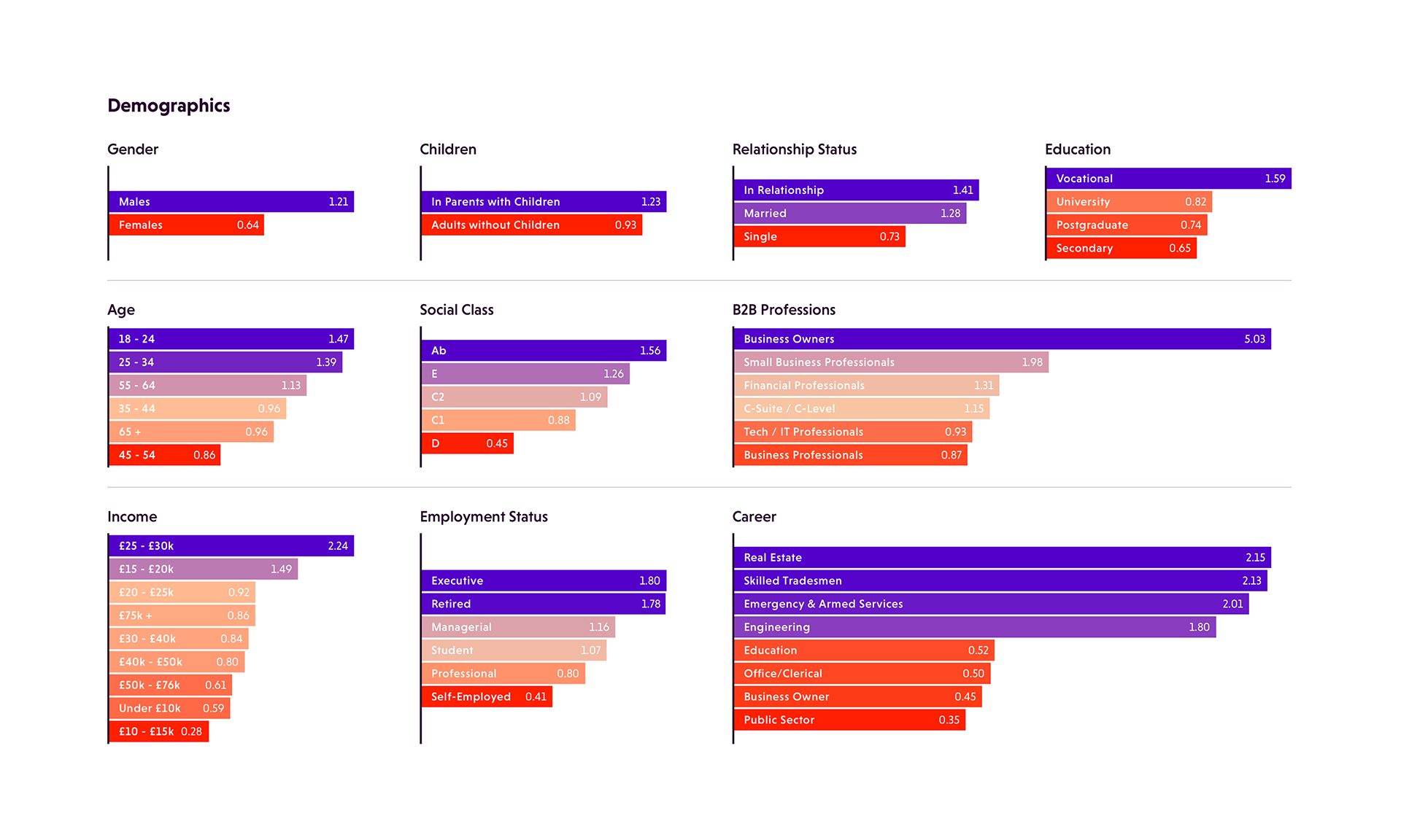
Implement this style across all platforms
Implement this style across all platforms
Including trading applications, Tableau dashboards, and PowerPoint template:
Where MiQ teams can access guidelines and templates for client communication:
04.
Deliver in-person design workshops to key internal stakeholders
Deliver in-person design workshops to key internal stakeholders
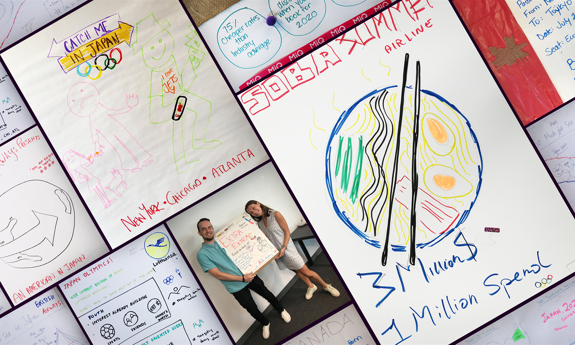
Total 20 sessions and over 200 participants across London, New York, Washington DC, Atlanta, Toronto, Bangalore, and Singapore offices to ensure strong adoption. One of the team exercises during these sessions was to create mockups of movie "insights" posters, using hypothetical campaign performance data: